Most novice web designers at the beginning of their journey still in the courses hear such a concept as modular grid, and wonder what it is and how to properly customize and use this tool.
From personal experience, I know that in many courses with titles "web designer from zero to pro" or " IU / UX designer in a month" this topic is either skipped, or give instructions, where they say everywhere to use a grid of 12 columns with margins of 80 to 100 pixels. And, as a result, it turns out that after taking these gore courses, a person sees beautiful works, thinks to repeat them, but the grid does not work, and the student, simply, does the work without a grid and completely forgets about it.
That's why I want to help beginners to understand this really voluminous issue.
What is a modular grid and why it is needed:
The grid itself is the most convenient way to organize different objects in the designer's project. The grid allows, without calculating each distance and size separately, laying the key patterns in its construction only once, then simply reuse them. For example, the grid allows you to observe the rule of proximity theory, in particular, the rule of external and internal, according to which internal distances should be smaller than external ones.
The grid helps:
define a unified design style, rules of elements arrangement, alignment, adding new elements to the layout;
speed up the work with the layout, because following the uniform rules, the time for making a decision where, what, how will be located, is minimal, in addition, it allows you to get a predictable result when working in a team;
reduce the probability of errors when reusing layout components. The component approach is used by developers in their work, so components allow the team to work synchronously, easily support changes and save time;
make the layout more aesthetically pleasing, elements proportional and structured. In addition, if a grid is used in the design, it helps the user to read information faster. The grid creates visual order and it becomes easier to navigate.

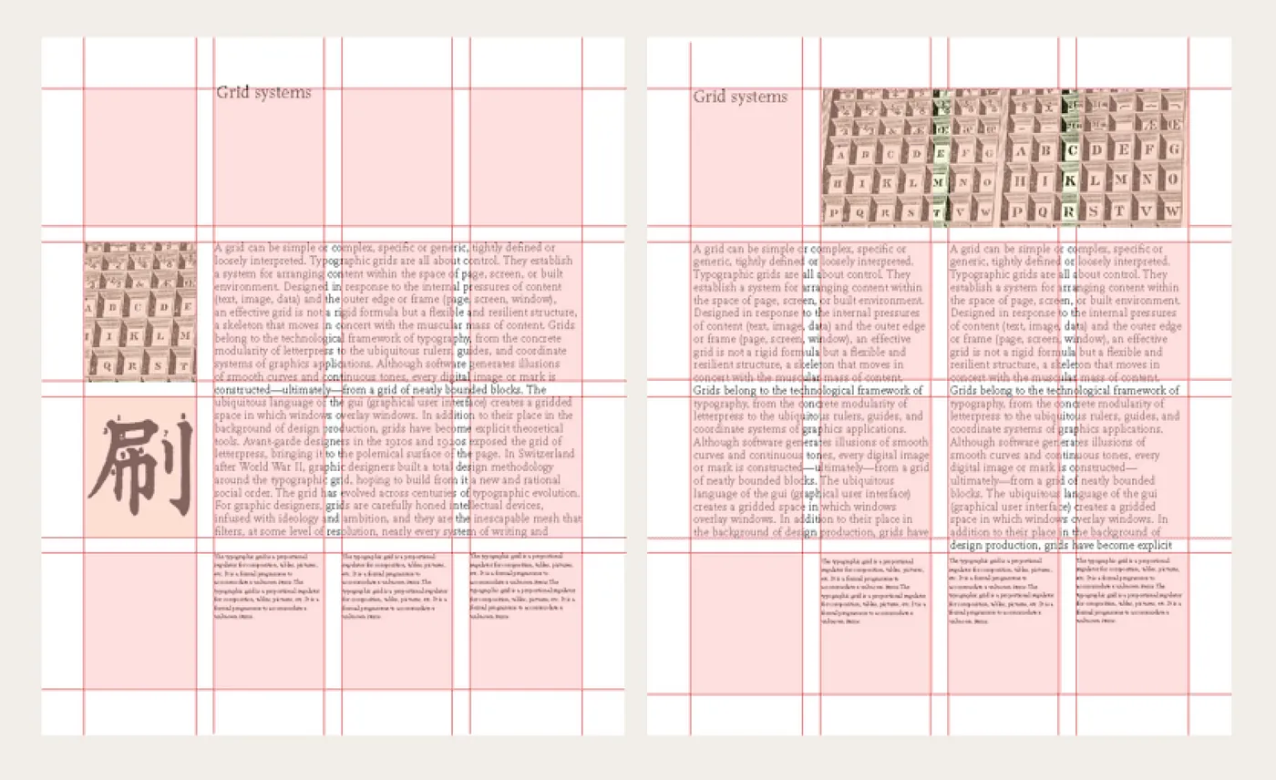
A Layout is a structure formed by grids. Grids are rows and columns that span the entire screen and divide it into many equal parts. These parts are called modules and are separated by spaces (gutter).
Types of grids
Depending on what is taken as a basis for building a grid, you can distinguish the following types: blocks, columns, module, hierarchical (visual weight and location of elements relative to each other).
Manuscript grid
Block or manuscript grid is the simplest type of grid, which is usually used in printed publications. Typically, such a grid is a standardized rectangle that contains content on a page or screen. Manuscript grids are best suited for informational websites with a continuous flow of textual content.


Column grid
Column grid - A grid that has columns in its structure. The width of the intercolumn (gutter) is determined by its purpose, if it simply separates elements from each other, then it is reasonable to make its width the minimum necessary, but it should be in any case significantly more than the line spacing, so that the lines in neighboring columns do not look like a continuation of each other.
The space between columns or rows (gutter) should be the same throughout the grid. This makes it easier to determine in which column to place text, and which columns should be reserved for images or illustrations. Newspapers are an excellent example.


Modular grid
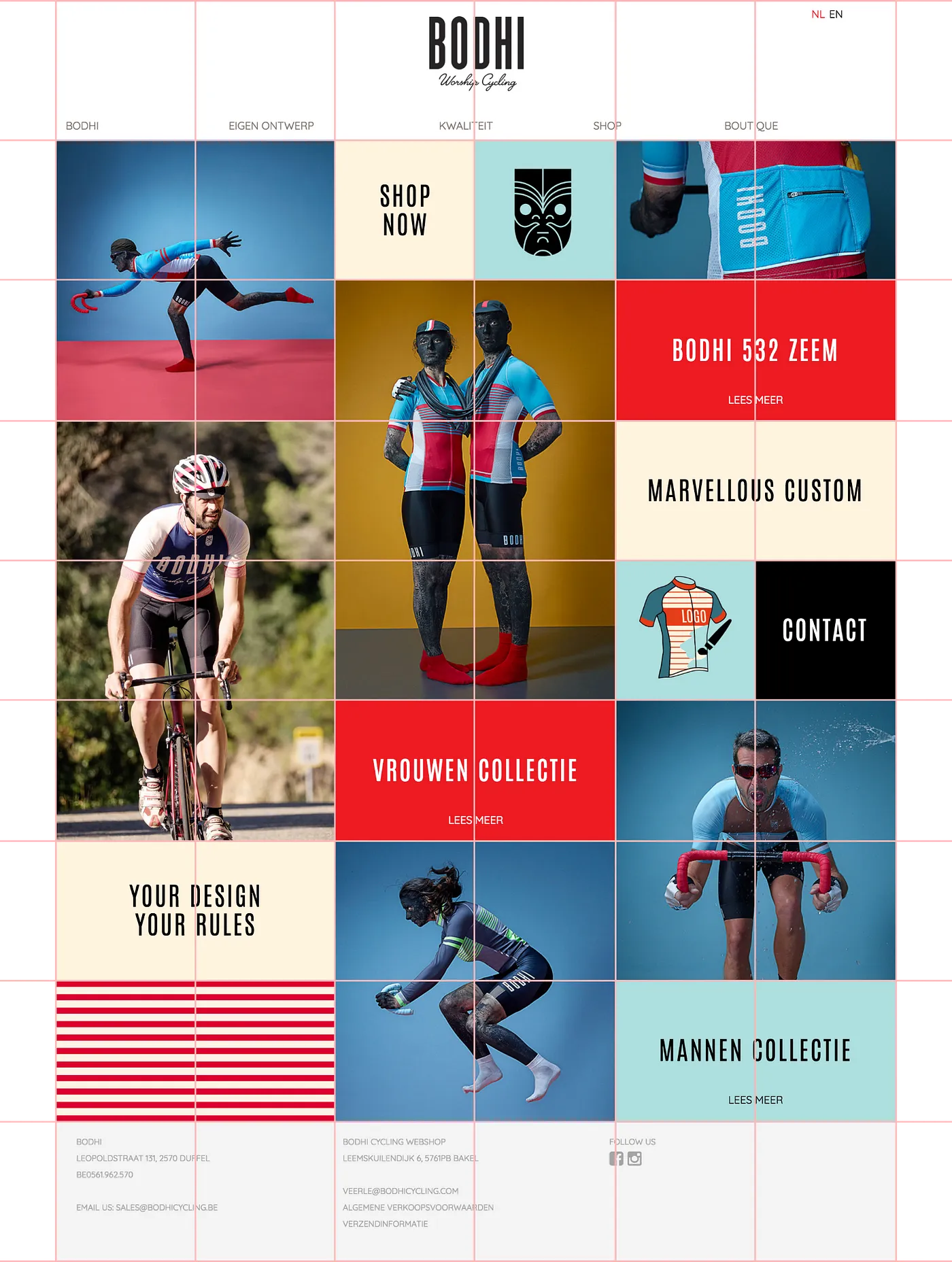
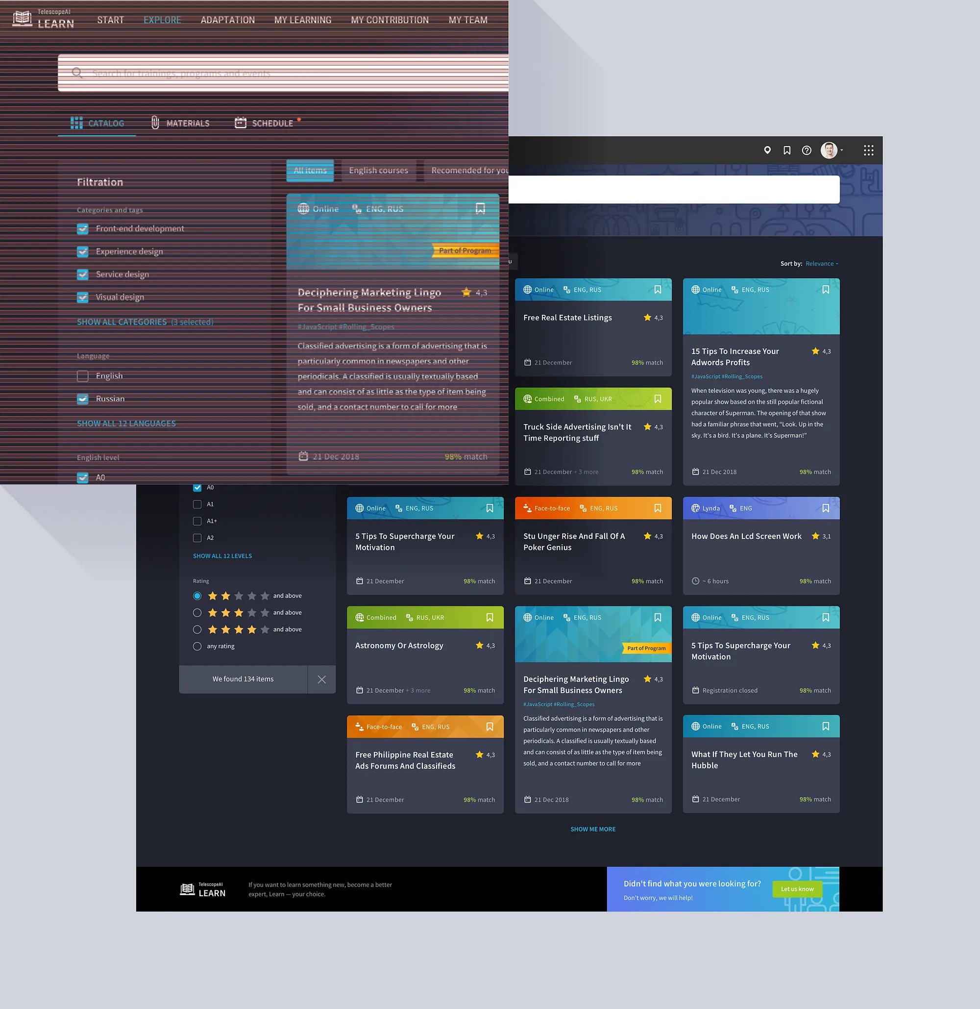
A modular grid is characterized by the presence of both vertical and horizontal membership. What is formed at the intersections is a module - a rectangle with a specified height and width, which is the basis of the composition. The grid determines how the layout will look as a whole and where individual elements will be located: text blocks, headers, images.
The arrangement of applications in our phones is also the result of a modular grid.

Hierarchical grid
Hierarchical - a grid that focuses on the proportions and visual weight of elements in a design. This type of grid is often used when content is not standardized and uniform. It is often found for business domains related to fashion, photography, art. You can use different sized modules to create a visual hierarchy based on the importance of the content. Make sure that the spacing between the blocks remains optimal.
The most difficult to build is a modular grid. Therefore, let's consider the principles of its creation.
The beginning of the construction
To build a modular grid, you must first build the basic grid, then apply to it columns, and, setting the size of the module, we will get the design, i.e. your designed for a particular project grid.
Why 8-pixel? As a step for this grid was chosen block 8x8 pixels, because most common devices have screen size in pixels is a multiple of eight, so it will be easier to design interfaces for them with this system. In addition, if all numerical values are even, it becomes easier to scale sizes and distances for a wide range of devices, keeping the design in its original form.

The recommendation to use an 8-pixel grid is also in Apple's Human Interface Guidelines.
You could use 10, but, again, most devices have a screen size in pixel multiples of eight and, in addition, the 10-pixel grid introduces more restrictions on element sizes.
8,16,24,32,40,48,56,64,72,80,88,96,104,112,120 15 dimensions
10,20,30,40,50,60,70,80,80,90,100,110,120 12 dimensions
Eventually you may decide to use both the 10 and 6 pixel grids as your base grids. The main argument in favor of choosing them should be their convenience.
Concepts of Hard and Soft grids
There are two approaches to using the base grid. When using hard grids, all elements have sizes divisible by the base grid block, for example 8 if we are talking about an 8-pixel grid, and are placed strictly on the grid.
The second approach is soft-grid, which boils down to using distances between elements that are multiples of 8 in our case.
The main benefit of using a hard grid is that no matter how you group elements together, you can always control internal and external indents and move containers of elements around like bricks. Material Design, where everything is designed for a 4-pixel grid (typography, icons and some other elements are designed using a 4x pixel grid, and the rest of the components using an 8-pixel grid) is usually fully consistent with this method.
The good thing about soft grids is that when it comes time to layout, using a grid will cause more of a challenge because programming languages don't use the same structure for specifying grids. When speed of implementation comes first, soft grids are more flexible and minimalistic in code structure. It will also be more preferable for iOS design, where most system graphics elements are not specified by a rigid grid.
Vertical rhythm
When choosing a base grid, it is important to remember that the grid spacing should be exactly within the line height of the main text. Let's assume that as a base font you have chosen a font with 16 pixels, then according to the recommendations of modern typography interlineage will be 150-200% of the character (sometimes more). To make the 8-pixel block of the base grid fit an even number of times in the height of the line, you can choose as an interlineage value equal to 24 pixels. Based on this line height of the main text, you can vary the layout and follow the vertical rhythm.
Which approach to choose will depend on the skills and experience of the team, as native mobile apps have the ability to work with a baseline of text, but with a browser it's more complicated. You'll have to work from a baseline and then use very specific spacing to make your content align.
This means that now each design element will occupy a certain number of lines in height. Rhythm is easy to work with, you measure everything in lines, not pixels. For example, menu and header of the first level - 2 lines, image - 8 lines, button - 1 line, indent - 1 line, etc.
Column grid
The column grid is responsible for the horizontal rhythm, which can be achieved by choosing a column width to indentation ratio that will allow for easy repositioning of larger blocks.

Why is the 12-column grid so popular? Because the number 12 is divisible by: 12, 6, 4, 3, 2, 1. Therefore, the grid is flexible and allows you to organically layout blocks of almost any number or width. Moreover, by discarding 1 or 2 columns as margins on the edges of the layout, you get a block in the center that is also divided into 10, 5 or 8.
What is taken into account when constructing a column grid
Breakpoints
In adaptive design, it is necessary to keep the layout structure and neatness of information presentation for all resolutions, so layouts should be made for all control points. Grid columns can remain static and be added as the screen width increases, and elements can change their position, obeying the column rhythm and breakpoints. These can be 480, 600, 840, 960, 1280 and 1440.
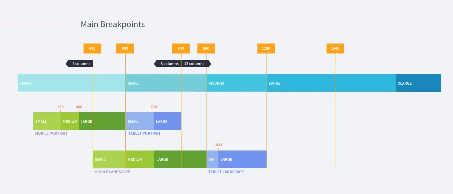
And for each screen resolution, respectively, there will be a different number of columns. As a detailed example, it is recommended to check out Material Design responsive layout grid. With a tight deadline, you can choose the most popular 2-3 transition points using web analytics of your resource or your competitors.
Or you can keep the number of columns for all transition points and change the size of columns and inter-columns between them proportionally.
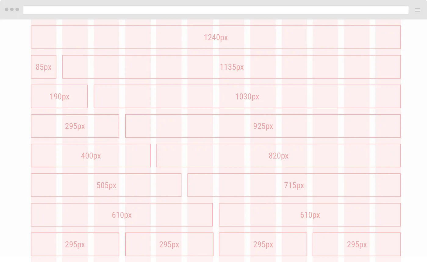
Example of grid calculation for a transition point of 1280 pixels.
Let's determine the number of columns. For example, there will be a gallery of six photos with text descriptions, two large graphics and three paragraphs of text. Then the number of columns should be a multiple of 2, 3, and 6. A number of 12 will do. Dividing the working area of 1280 pixels into 12 columns (columns) with the width of gutters (gutters) for example in 20 pixels will give the width of columns in 85 pixels, while reserving 20 pixels of indentation from the right and left edges. So we have 12 columns of 85 pixels, 11 gutters of 20 pixels and 20 pixels left for the right and left margins.
1280px = (85px12)+(20px11)+(20px+20px)
This distribution gives combinations of elements of different sizes.
Fluid Grid or "rubber" grid is also used on the web. Its peculiarity is that its distances are set in percentages rather than pixels. The content area is taken as 100%. Below is a simplified example for a layout width of 1000 pixels with 6 columns.
Design grid
Having built the base grid, and having defined the column grid, we get the intersection of columns and rows, which forms a module - the basic unit of the modular grid. When choosing the size of the module, we must remember that too large a module will give an inflexible grid, too small loses its meaning. Modules can and should be combined into groups, thus we will get a design grid - the final version of the modular grid, designed for a particular project.
The design (final modular) grid can be composed of two narrow columns on the sides and one wide column in the center. It may consist of identical columns with wide indents, or it may consist of "floating" columns (when there are two, when there are five), but in such a way that it becomes visible by repeating the layout of materials and nesting "less into more".
Columns and column spacing
First of all, from the content. Here everything is simpler than with height. When it comes to print products, in the vast majority of cases you can guess the number of columns at the stage of first drafts.
For example, if you're layout a block about the seasons, your magic number will probably be 4. You can group them in one row or two. In this case, the number of columns will be a multiple of either two or four. So it makes sense to rely on the numbers 2, 4, 6, 8, 12 or 16.
Let's make it more complicated. Let's assume that under the block with seasons you have a block with three advertisements. Obviously, a multiple of three columns would be more convenient for this part of the layout: 3, 6, 12... But a 3-column grid is obviously unfortunate for the seasons. So we need to look for some common denominator for them. The previous paragraph suggests that you need a 6 or 12 column grid.
Spacing between columns (gutter)
In most cases, the column spacing is much smaller than the column width. Its size is also determined by the peculiarities of the content. If you are designing an interface with a lot of classic controls, a narrow column spacing serves as a convenient separator. For example, between a search box and a button, or between a checkbox and its label. (Although in general it makes sense to think about a "square" grid: 4px or another grid without any columns at all, and there are reasons for that too). If you're layout a page with large text blocks organized in only 2-3 columns, then it makes sense to make the inter-column spacing large to give the content maximum air.
A lot of things can be designed with zero column spacing when the number of columns is large, I do this in most projects. In this case, the width of an entire column is taken as the indent, and all marginalia are large, characteristic of "noble" typography.
Conclusion
Grids are really complex mechanics in design, lots of rules, many difficult to implement into a project at once. But the main thing is that a grid is a tool, it can be useful, and you can do without it. I advise beginners to use them, to understand them, it will simplify the work and make projects cleaner and neater.
