In this article, I will guide you through the process of creating a frosted AppBar with a sliding element beneath it. The final result is presented at the top as it works in the media network application.
🔗 Quick Access: GitHub Project
The idea was born
The initial idea was to create a SliverAppBar with an expanded element. However, SliverAppBar collapses when scrolling down, as shown in this video:

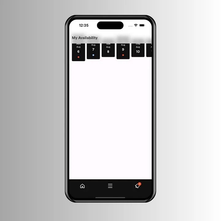
Another concept that came to my mind was inserting horizontal dates inside the AppBar here:

But how to make it expand? Dynamically changing toolbarHeight can be tedious especially when the precise height of those scrolling dates is unknown.
There is a possibility to hide the horizontal dates behind the AppBar and slide them down while scrolling. Here is the final stack for the sliding element. GlassFrostAppBar will include scrolling dates and the SingleChildScrollView will contain other elements, such as production, job offers, and more.

Crafting the Magic
1. The Transparent AppBar
The first component will be AppBar. It should be transparent, so the GlassFrostAppBar behind could use a frosted effect.
appBar: AppBar(
        systemOverlayStyle: const SystemUiOverlayStyle(
          statusBarIconBrightness: Brightness.dark, // For Android (dark icons)
          statusBarBrightness: Brightness.light, // For iOS (dark icons)
        ),
        scrolledUnderElevation: 0,
        elevation: 0,
        backgroundColor: Colors.transparent,
        centerTitle: false,
        title: Text('My Availability', style: context.textTheme.displaySmall),
      ),
2. Frosted Dates
Next will be the horizontal dates inside with a frosted effect — GlassFrostAppBar. To create such an effect we will use the BackdropFilter with ClipRect.
import 'dart:ui';
import 'package:flutter/material.dart';

class GlassFrostAppBar extends StatelessWidget {
  const GlassFrostAppBar({super.key});

  @override
  Widget build(BuildContext context) {
    return ClipRect(
      child: BackdropFilter(
        filter: ImageFilter.blur(sigmaX: 10, sigmaY: 10),
        child: DecoratedBox(
          decoration: BoxDecoration(color: Colors.white.withOpacity(0.7)),
          child: Stack(
            children: [
              Container(height: MediaQuery.of(context).padding.top),
            ],
          ),
        ),
      ),
    );
  }
}
Current result:
3. The Slide Effect
The next step involves creating the slide effect. Our dates will be moving from top to bottom. Also, we need to make them invisible at the top because the AppBar is transparent and we don’t want to see these dates too early. We are going to need a Tween<Offset> animation to do this.
class GlassFrostAppBar extends StatefulWidget {
  const GlassFrostAppBar({super.key});

  @override
  State<GlassFrostAppBar> createState() => _GlassFrostAppBarState();
}

class _GlassFrostAppBarState extends State<GlassFrostAppBar> with TickerProviderStateMixin {
  late AnimationController _expandController;
  late Animation<Offset> animation;

  @override
  void dispose() {
    _expandController.dispose();
    super.dispose();
  }

  @override
  void initState() {
    super.initState();

    _expandController = AnimationController(
      vsync: this,
      duration: const Duration(milliseconds: 200),
    );
    animation = Tween<Offset>(
      begin: Offset.zero,
      end: const Offset(0, 1.5),
    ).animate(
      CurvedAnimation(
        parent: _expandController,
        curve: Curves.fastOutSlowIn,
      ),
    );
  }

  @override
  Widget build(BuildContext context) {
    ...
  }
}
4. The Slide Trigger
But how would we know when to slide down the dates? It should be right after the expanded dates scrolled behind the AppBar so that the user is always able to observe the dates. We must pass the ScrollController of SingleChildScrollView from the stack to the GlassFrostAppBar. Then we need to add a listener to that scroll controller.
widget.mainScrollController.addListener(() {
      if (widget.mainScrollController.offset > 140) {
        _expandController.forward();
        setState(() {
          _isVisible = true;
        });
      } else {
        _expandController.reverse();
        setState(() {
          _isVisible = false;
        });
      }
    });
The _isVisible variable ensured the dates remained concealed at the top behind the AppBar. Combining it with a sliding animation we have this result:
@override
  Widget build(BuildContext context) {
    return ClipRect(
      child: BackdropFilter(
        filter: ImageFilter.blur(sigmaX: 10, sigmaY: 10),
        child: DecoratedBox(
          decoration: BoxDecoration(color: Colors.white.withOpacity(0.7)),
          child: Stack(
            children: [
              Container(height: MediaQuery.of(context).padding.top + (_isVisible ? 56 : 0)),
              Visibility(
                visible: _isVisible,
                child: Padding(
                  padding: const EdgeInsets.only(top: 8),
                  child: SlideTransition(
                    position: animation,
                    child: const Padding(
                      padding: EdgeInsets.symmetric(vertical: 8),
                      child: HorizontalDates(isCollapsed: true),
                    ),
                  ),
                ),
              ),
            ],
          ),
        ),
      ),
    );
  }
Assembling all together and here is the outcome:

Looks bad … The dates appear to be visible on their way down and also they vanish abruptly on the ascent. The solution here could be to gradually make dates invisible with FadeTransition. However, a better idea involves SizeTransition animation. We can stick the dates at the bottom of the AppBar and make them invisible by reducing their size to zero. This is how it will work:

With SizeTransition, we no longer require to toggle visibility. Here is the implementation:
return ClipRect(
      child: BackdropFilter(
        filter: ImageFilter.blur(sigmaX: 10, sigmaY: 10),
        child: DecoratedBox(
          decoration: BoxDecoration(color: Colors.white.withOpacity(0.7)),
          child: Column(
            mainAxisSize: MainAxisSize.min,
            children: [
              Container(height: MediaQuery.of(context).padding.top),
              SizeTransition(
                axisAlignment: 1,
                sizeFactor: animation,
                child: const Padding(
                  padding: EdgeInsets.symmetric(vertical: 8),
                  child: HorizontalDates(isCollapsed: true),
                ),
              ),
            ],
          ),
        ),
      ),
    );
And now, we can view the final result:

Thank you for reading! Dive into the complete code here: https://github.com/IlyaZadyabin/media
